Sky Sports
A scalable component system supporting the Sky Sports brand refresh.
Role:
Lead DS designer
Timeframe:
June - October 2025
Teams:
Brand, digital,
production, marketing, engineers, artworkers
Overview
Context
Designed and evolved reusable components and foundations to improve consistency, accessibility and production efficiency across Sky Sports campaigns.
Problem
Legacy components are no longer aligned with the new typeface and visual language, causing inconsistency and slowing campaign builds.
What I did
Audited existing components, updated foundations (colour, type, spacing) and tokens, standardised reusable components, and produced guidance for rollout across design and production teams. Accessibility was embedded across foundations and component states. This system applies core UI foundations and reusable component logic that mirror broader product design systems, adapted for the email platform within Sky’s wider product ecosystem.
Impact
Reduced component duplication by 80%, improved accessibility compliance, and enabled faster, more consistent campaign delivery across Sky Sports emails.
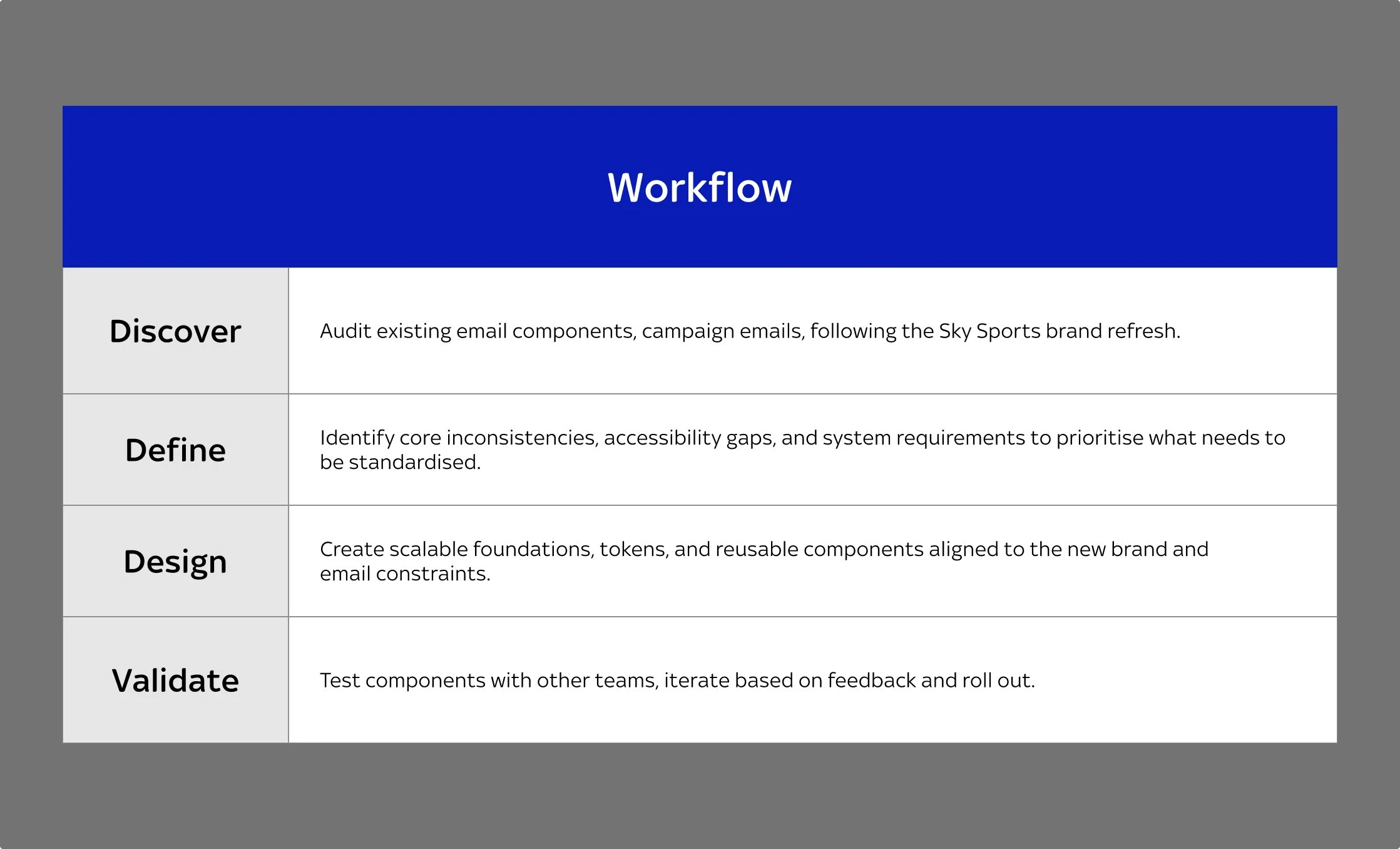
Workflow plan
Discover
Understanding the problem space
This section outlines how the problem space was understood through auditing legacy components and identifying brand and accessibility gaps following the Sky Sports refresh.
Audit findings
Foundation components
Campaign emails
Inconsistent findings
Foundations
Focusing on the typography, it currently uses multiple Sky fonts, text sizes these both will need to be looked at again with the new font and accessibility needs to be checked. For colour, the palette has been updated, needs to be added and accessibility needs to be checked also. Tokens have not be set up for any of the foundations including spacing, border radius, breakpoints, and possibly component related tokens. Icons weren’t properly organised, and will need to create a library.
Campaign email templates and Inconsistencies
Looking at some of the emails there are many inconsistencies such as different buttons, heading inconsistencies, spacing issues etc. This gives a good oveview that the legacy system wasn’t working and these issues will need to be addressed in the new system.
Pain points
After the brand refresh, the brand team needed emails to reflect stronger use of blue and red, but existing templates relied heavily on white and lacked alignment. Production also needed campaigns to launch quickly using the new brand, while any new layouts required marketing approval.
Summary
Legacy email components no longer aligned with the Sky Sports brand refresh. It was creating inconsistency and inefficiency across campaign workflows. The foundations had a few issues, and this needs to be addressed in the new system.
Define
Key decisions
This section explains how system priorities were defined by identifying which inconsistencies to standardise first and why.
Focus the system on high-impact email components
Decision
Prioritised core, high-use email components (e.g. buttons, pricing, data modules) before addressing legacy components.
Why
These components appeared most frequently across campaigns and had the greatest impact on consistency and build efficiency.
Outcome
Improved production speed, provided clearer guidance for campaign builds, and enabled faster adoption across teams.
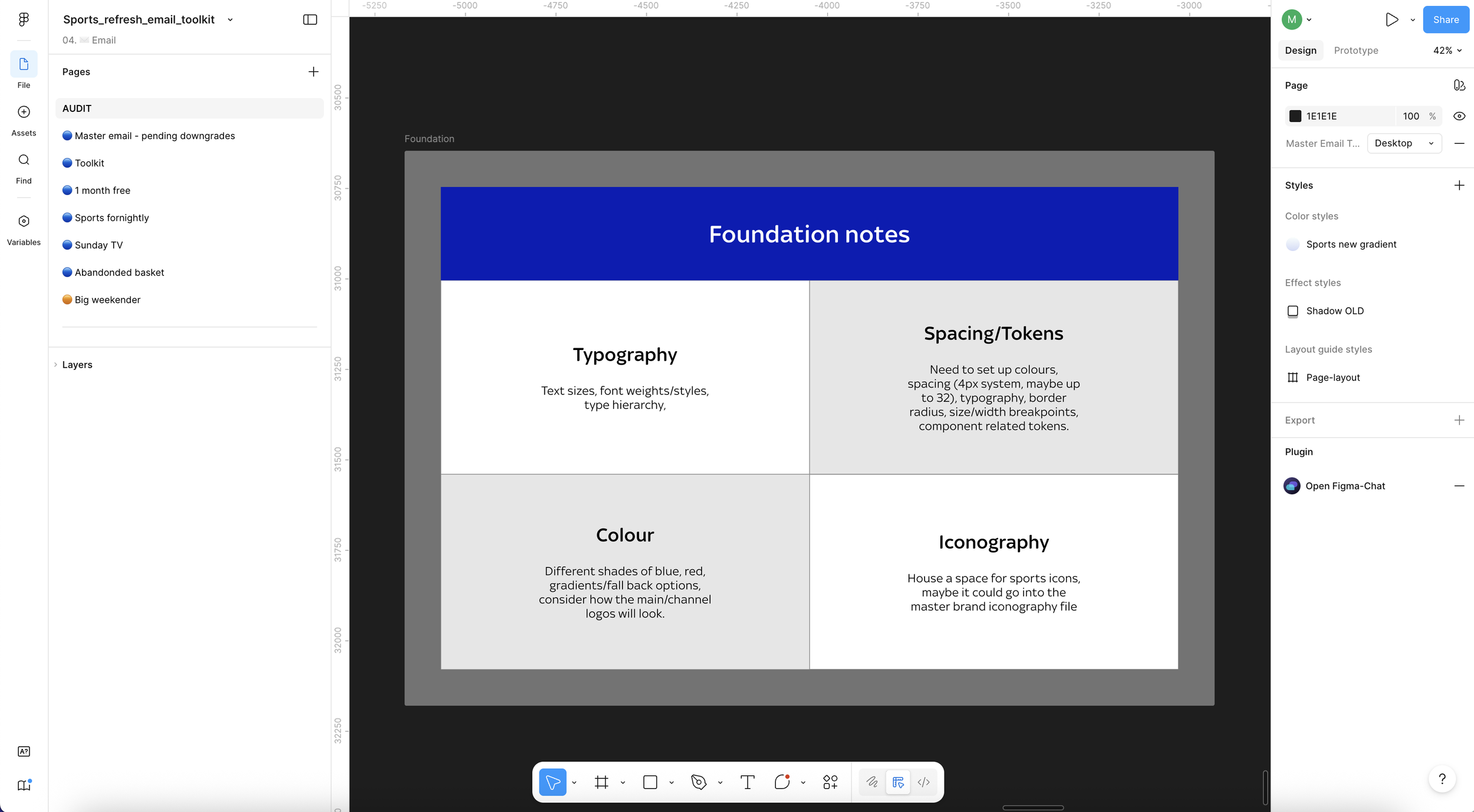
Organising my thoughts about foundations
Standardise foundations before expanding components
Decision
Established shared typography, spacing, colour, and radius foundations before scaling components.
Why
Audit findings showed brand misalignment and accessibility risks across components following the refresh.
Outcome
Improved consistency, reduced duplication, and enabled scalable rollout of the new brand.
The entire legacy component library
Prioritise accessibility into the system
Decision
Defined accessibility requirements at both foundation and component level rather than relying on manual checks. Accessibility considerations included colour contrast checks, readable typography scales and layout structures designed for clarity across devices and email clients.
Why
Legacy components showed inconsistent contrast, type sizing, and spacing, creating accessibility risks across campaigns.
Outcome
Established a more accessible baseline for all emails and increased confidence and consistency in campaign outputs.
Meeting notes about EAA accessibility
Design
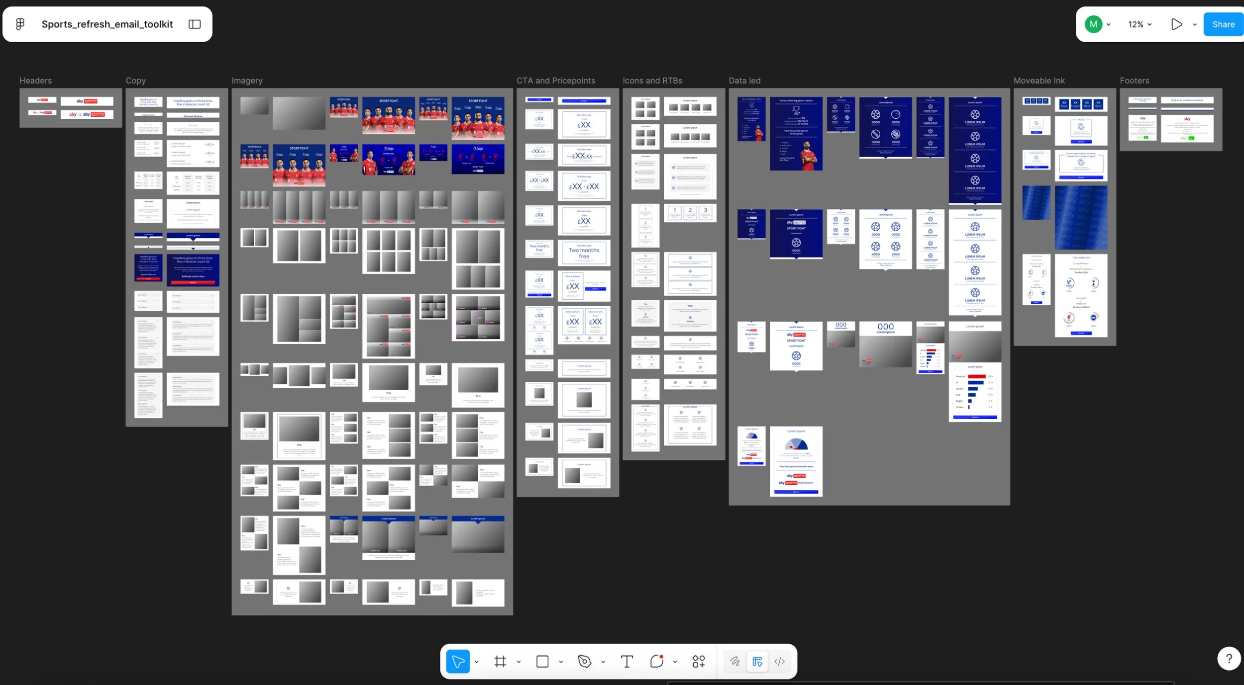
Building the system
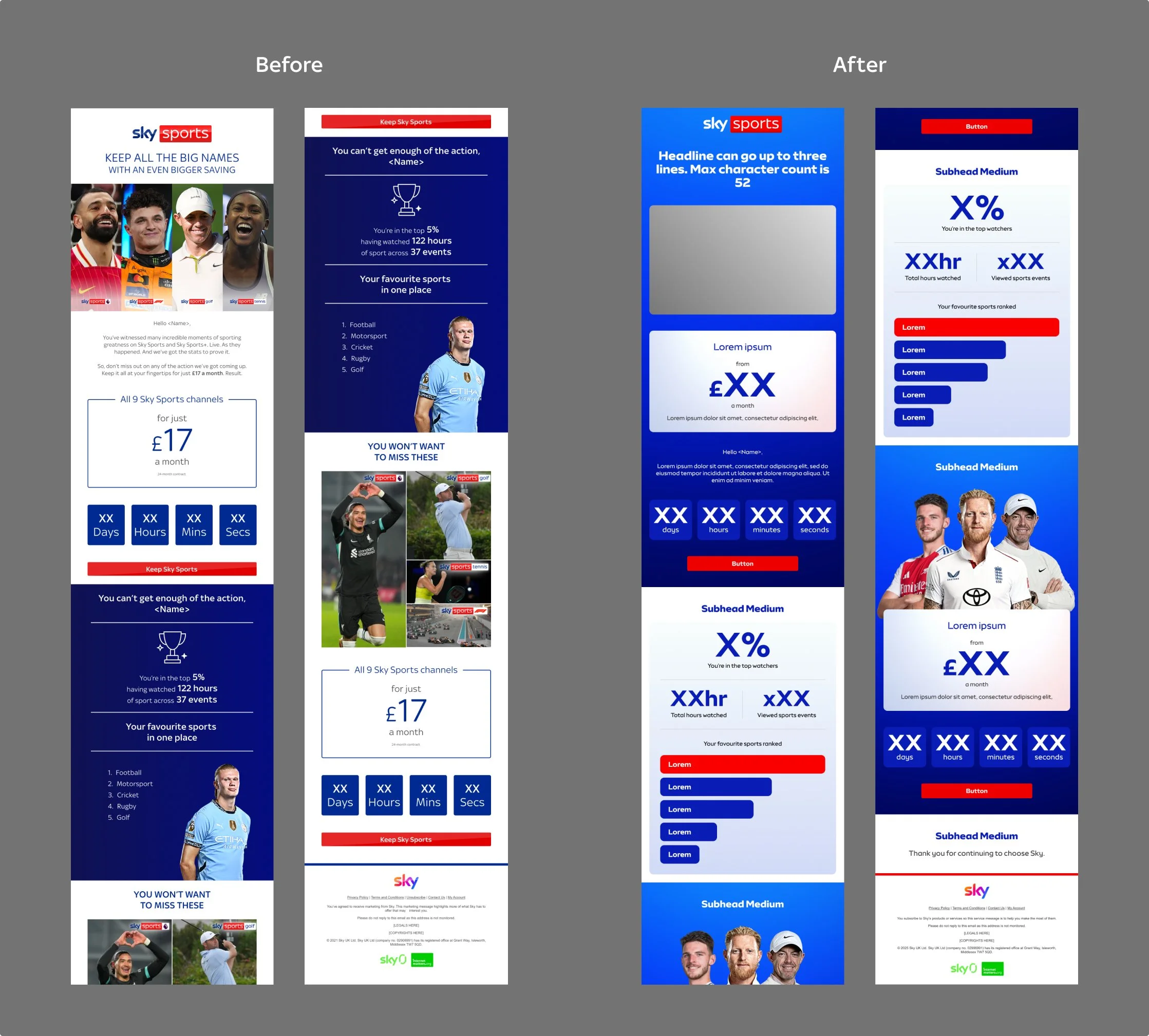
Core email components were standardised using shared foundations and accessibility considerations, with implementation support from a senior digital artworker. This section focuses on the price point component and it’s specification for consistent reuse across Sky Sports emails. Accessibility considerations included contrast checks, readable typography scales, clear fall back states states and consistent button behaviour across themes.
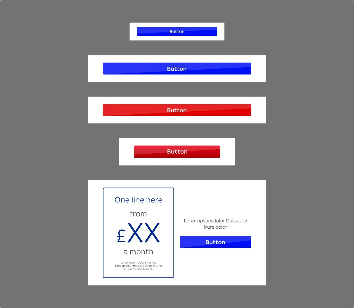
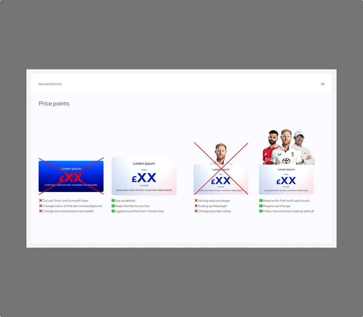
Price point component deep dive
Before/problems
The legacy price point varied across campaigns, title were outside instead of inside like the library, there was no spacing rules, legal lines were becoming unreadable and multiple variants were unused from the library.
Exploration
Aligned to the brand team’s direction for the price point to use core brand colours, I tested contrast and accessibility, collaborated with engineers, stress-tested responsive layouts, tokenised typography and spacing, and added fallback states to ensure consistent display across email clients and devices.
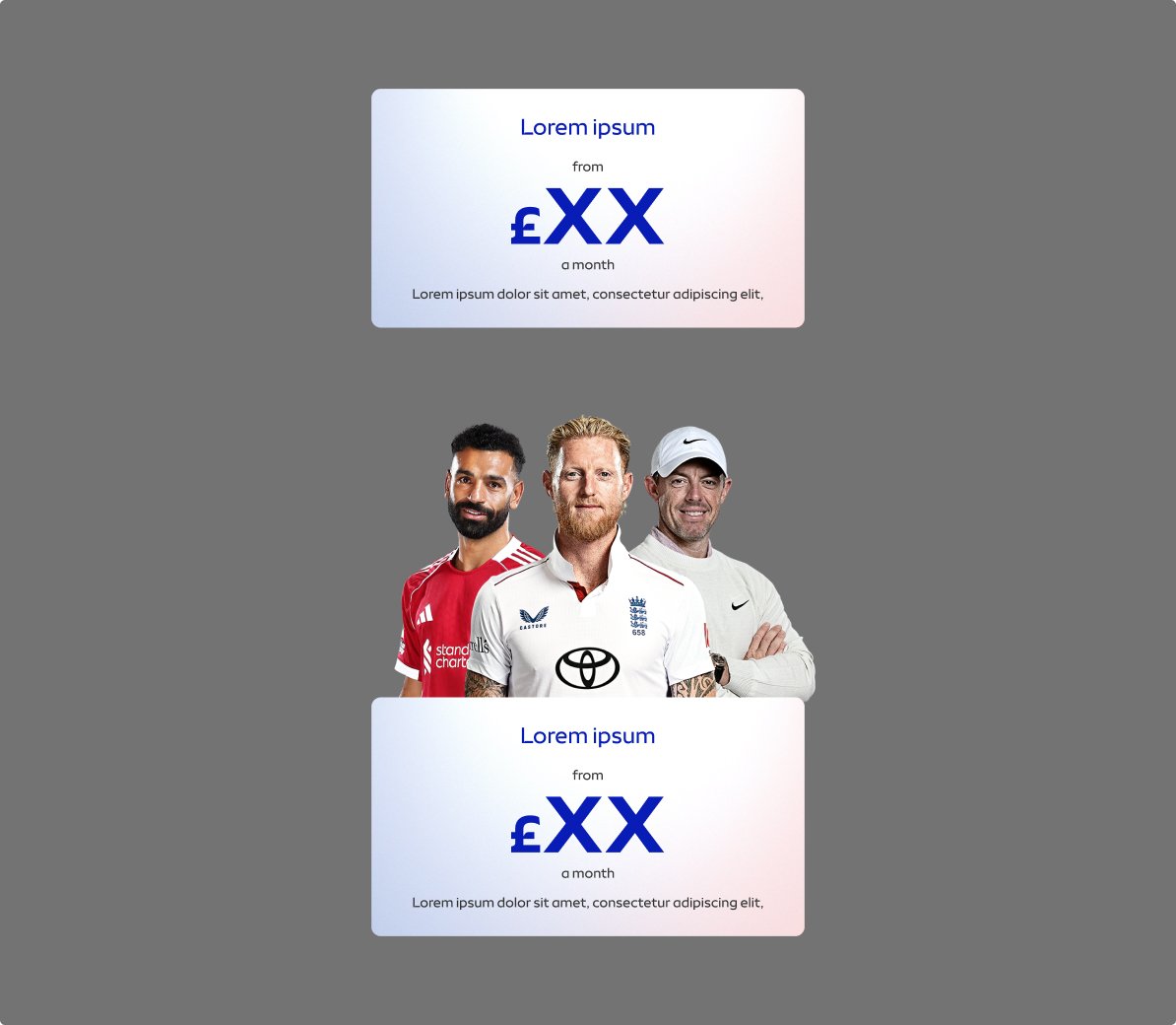
Variants
Top one is default and the other is an option to use whenever there is a need for a final push at the end of the email for multiple sports.
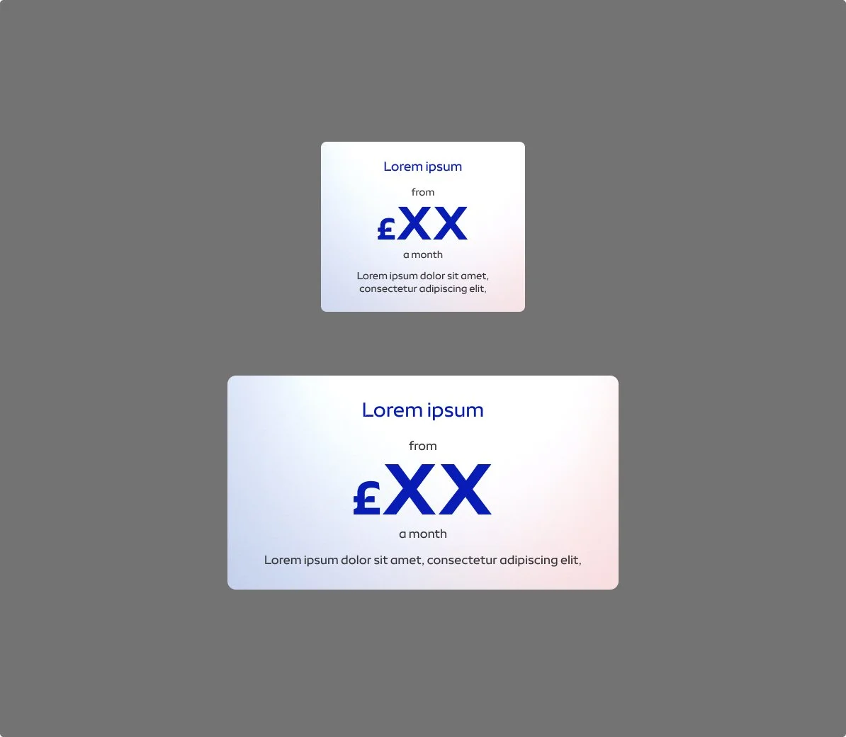
Sizes
Responsive sizes to cater for both mobile and desktop.
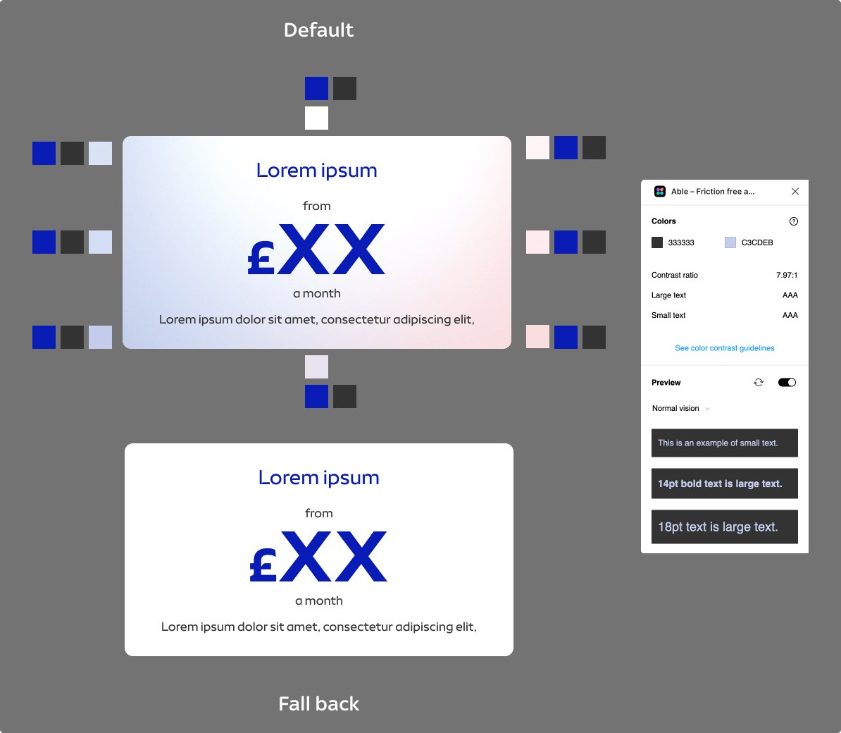
Accessibility
Speaking with engineering we created a fall back state as some users won’t see it. We also tested the typeface and again created a fall back option.
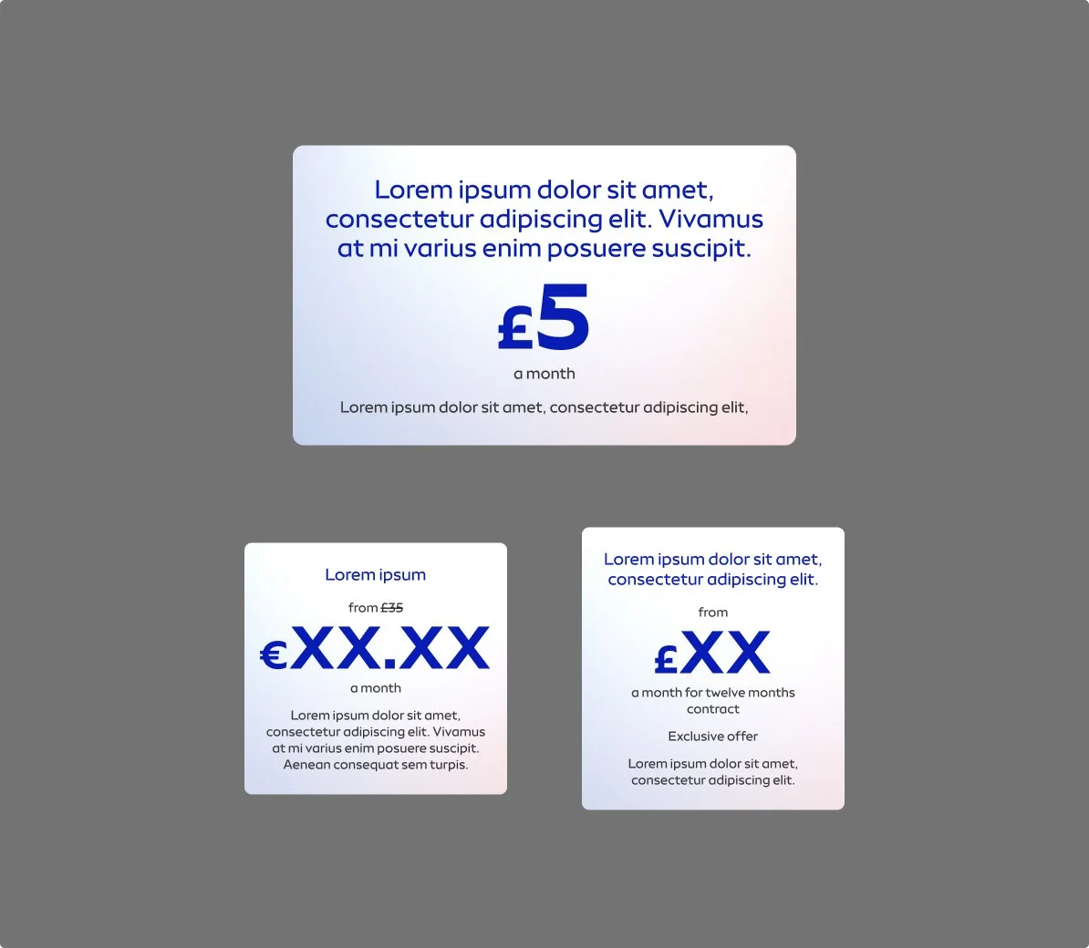
Stress testing
Tested with varying price lengths, promotional states, and extended copy to ensure consistent hierarchy and layout across email scenarios.
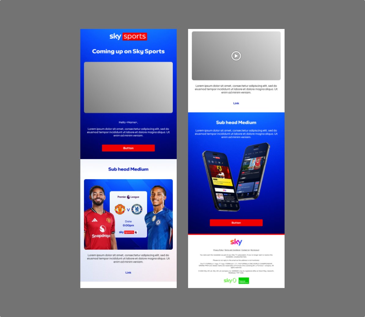
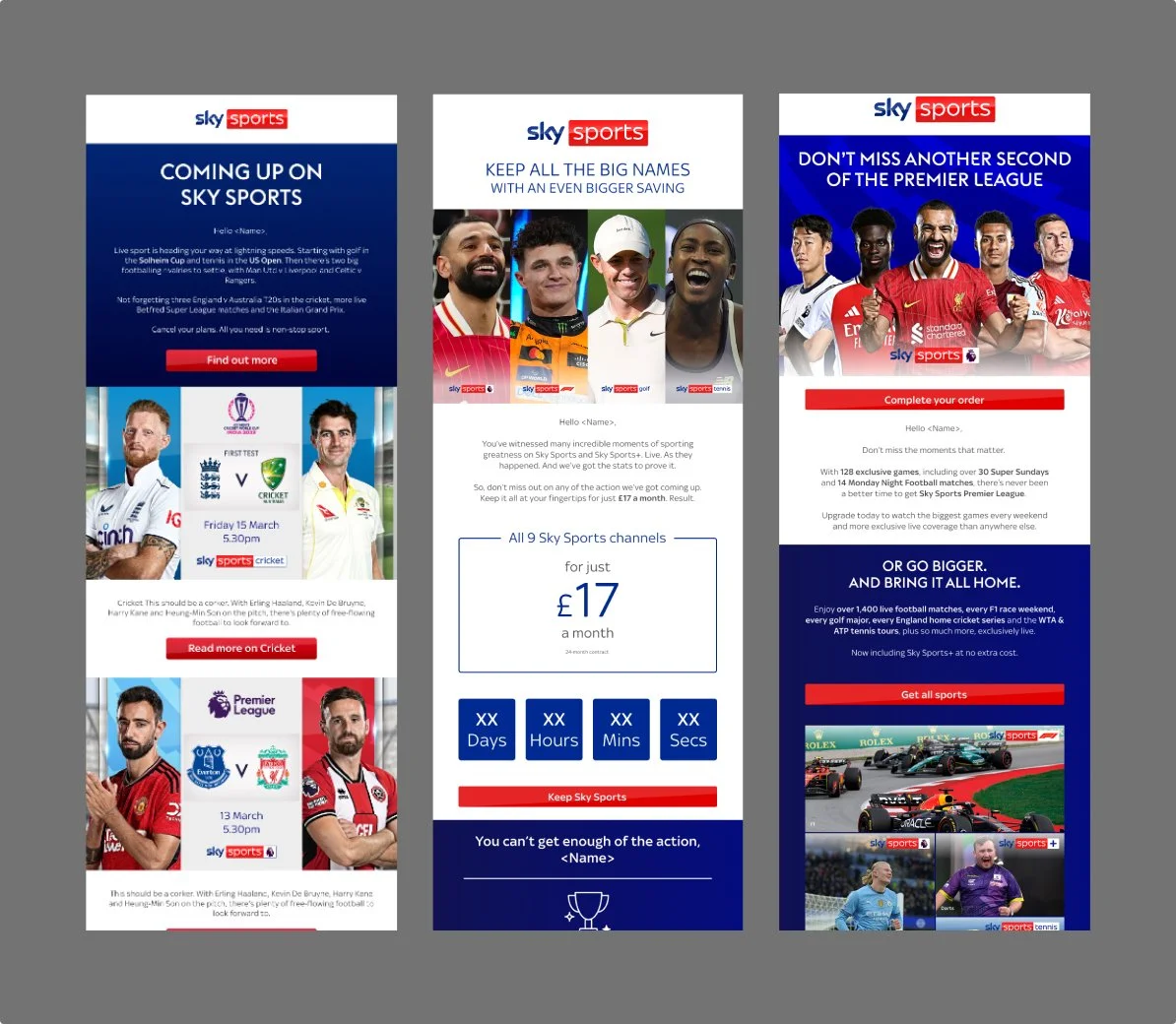
Email templates
Along with creating all components, I re designed the live campaign email templates. This was also a good way to see the components in an live job.
Documentation
Creating a full guideline for teams to access, detailing considerations, do’s and don’ts, all the new modules and all email examples templates.
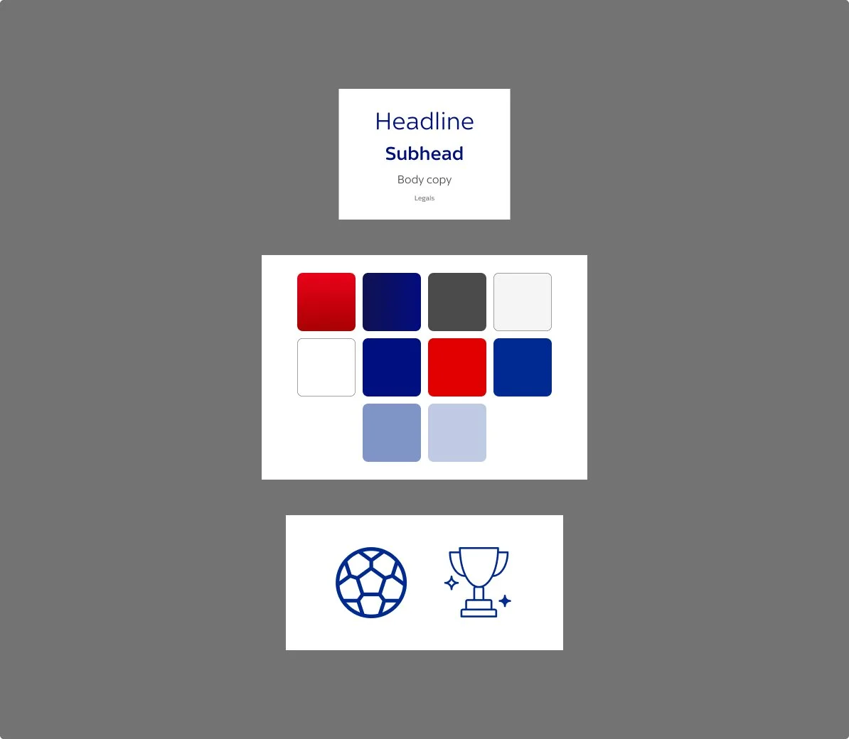
Foundations and tokens
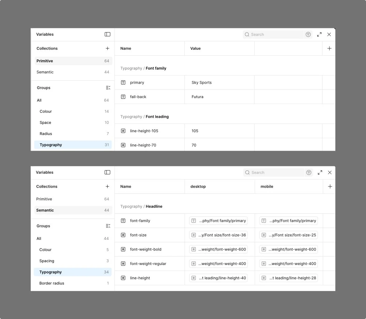
Typography
Primitive tokens were established for font families, sizes, weights, and line heights, then mapped to semantic styles for headings, body, legal, and price points across desktop and mobile.
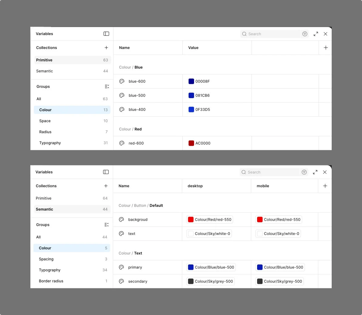
Colour
Primitive brand and masterbrand colours were defined and mapped to semantic roles, enabling consistent application across typography and component states such as buttons.
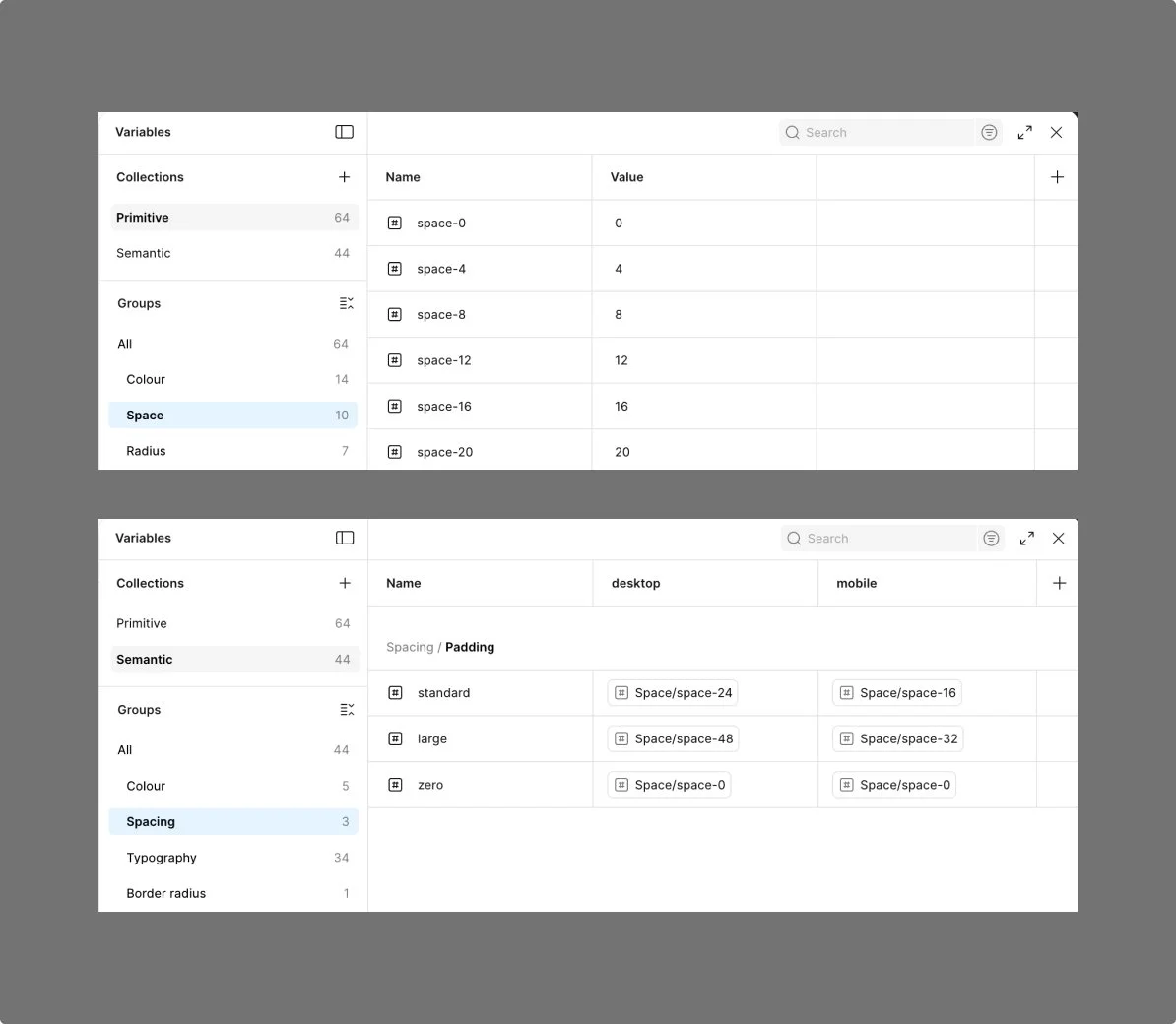
Spacing
Primitive spacing and radius tokens were defined using a 4px scale and mapped to semantic values for padding, layout spacing, and corner radius across components.
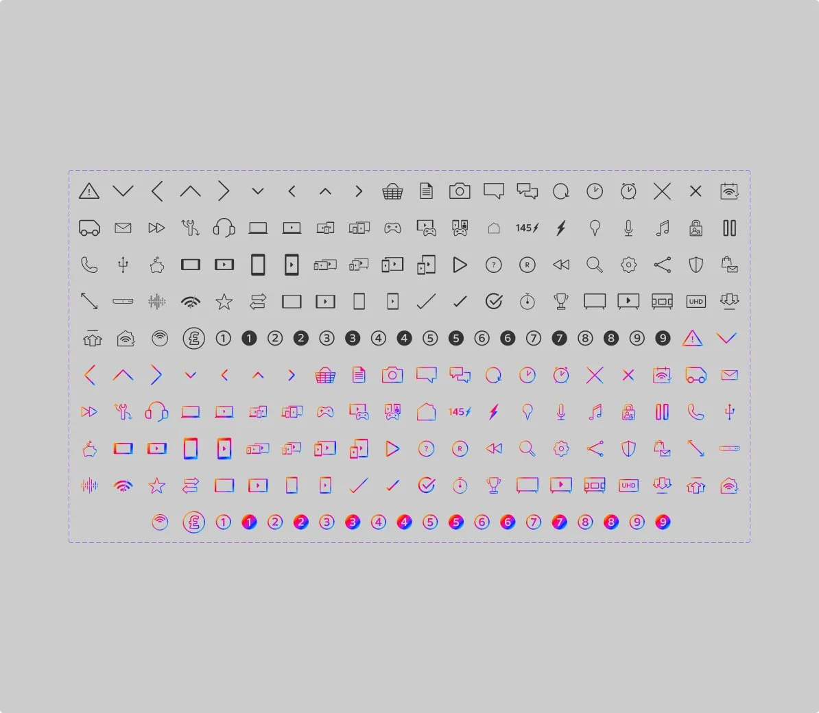
Iconography
Brand initially didn’t want icons, so we didn’t include them in the foundations. After release, performance data from the “Hurry” message showed higher engagement with icon animations, so Brand approved icon use. Sports icons are still limited, so we’re currently sharing the Masterbrand icon library.
Validate
Making it usable, adoptable, and ready for scale
This section describes how the system was tested, iterated, and rolled out with the teams to ensure it was usable, adoptable, and ready to scale.
Adoption
Who uses it
Designers across Sky Creative including production and occasionally marketing teams use the system to build Sky Sports email campaigns.
How it was tested and rolled out
Components were stress-tested across real campaign scenarios to ensure teams could build emails independently. Feedback informed refinements to clarity and usability. I collaborated with engineers and production to ensure components translated into buildable modules with consistent tokens and accessible colour usage throughout.
Where guidance lives
Guidance sits in the Sky Creative Design System workspace. Teams can contact our team distribution list for support, and I’m also available for system questions.
Engineering handoff
Collaborated with engineering to translate design specs into reusable CSS components, ensuring consistent spacing tokens and accessible color contrast.
Governance
Requests & prioritisation
Requests come from Artwork, Production, and Marketing via my producer. We assess whether existing components can be reused or if a new one is needed, then prioritise scalable, high-use components over one-off bespoke requests.
Design, build & review
I lead the component design and system updates, with artwork supporting the build. Changes are reviewed with the Creative Director and tested with engineering for feasibility and accessibility. We introduced clearer component structure, naming conventions and documentation to support ongoing maintenance and team adoption.
Release & versioning
Updates are communicated through the central Design System SharePoint, the updated Figma library and team comms.
System evolution
Impact and growth
Impact
Improved consistency and accessibility across Sky Sports email campaigns. Increased confidence from designers and production teams. Components were validated through real campaign workflows, reducing production friction through clearer guidance.
40 components
Instead of 168
1 font
Instead of 9
2 buttons
Instead of 7
Learnings
Continue validating new components through live usage and regular feedback loops.
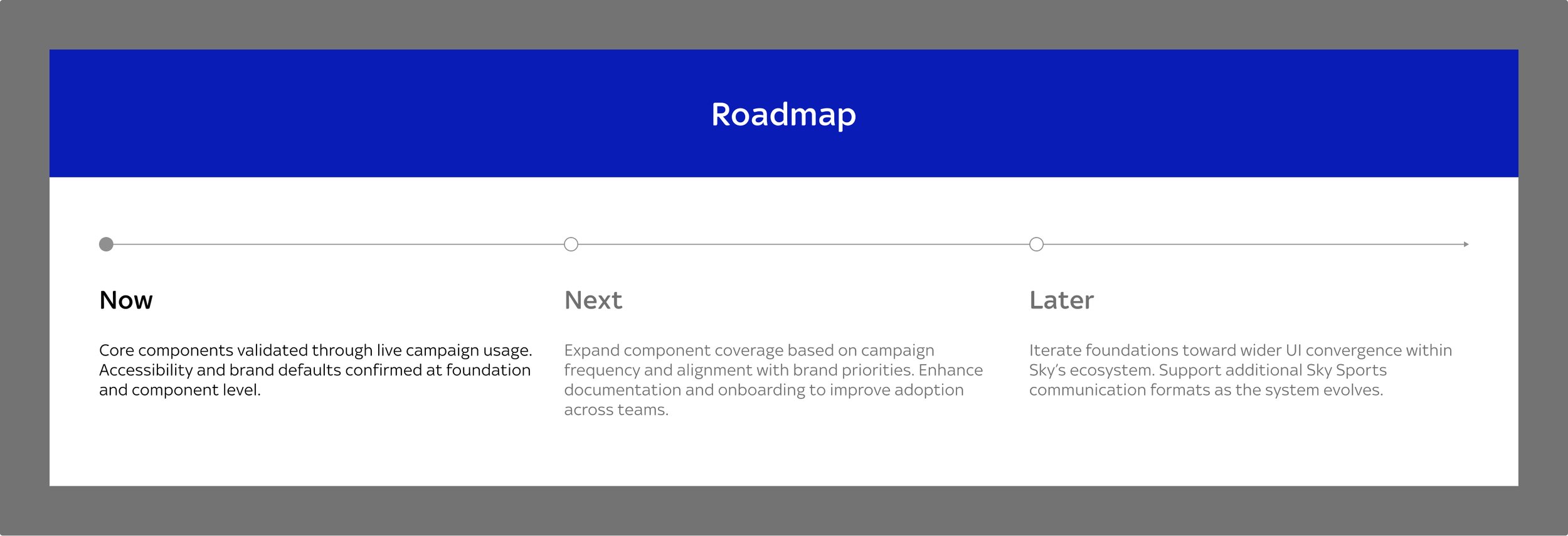
Next steps
Continue validating new components through live usage and feedback loops.