Boots
A mini design system supporting Boots web and app consistency.
Role:
Lead DS designer
Timeframe:
August - December 2025
Teams:
Self-initiated project
Overview
Context
Designed as a mini scalable UI system for web and app, redefining foundations and standardising reusable components. Shows how shared tokens and foundations can enable consistent, cross-platform design.
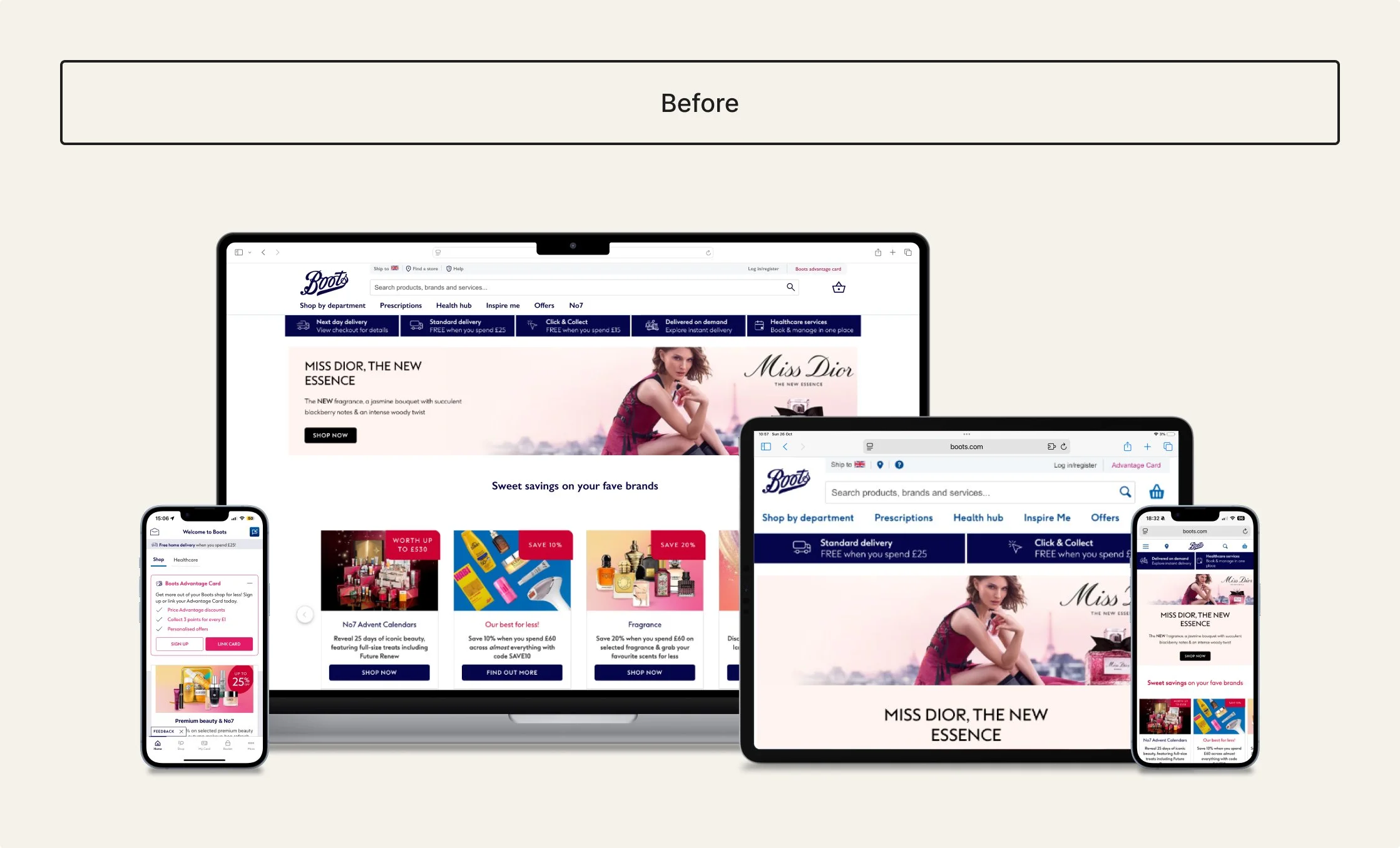
Problem
Inconsistent buttons, cards, and form elements led to varied behaviours, reduced usability, and made scaling difficult.
What I did
Redefined tokenised foundations, consolidated core components (button, card, form), structured a Figma library, and documented guidance to support consistent implementation.
Impact
Established how a structured system improves consistency, reuse, and scalability across Boots digital interfaces.
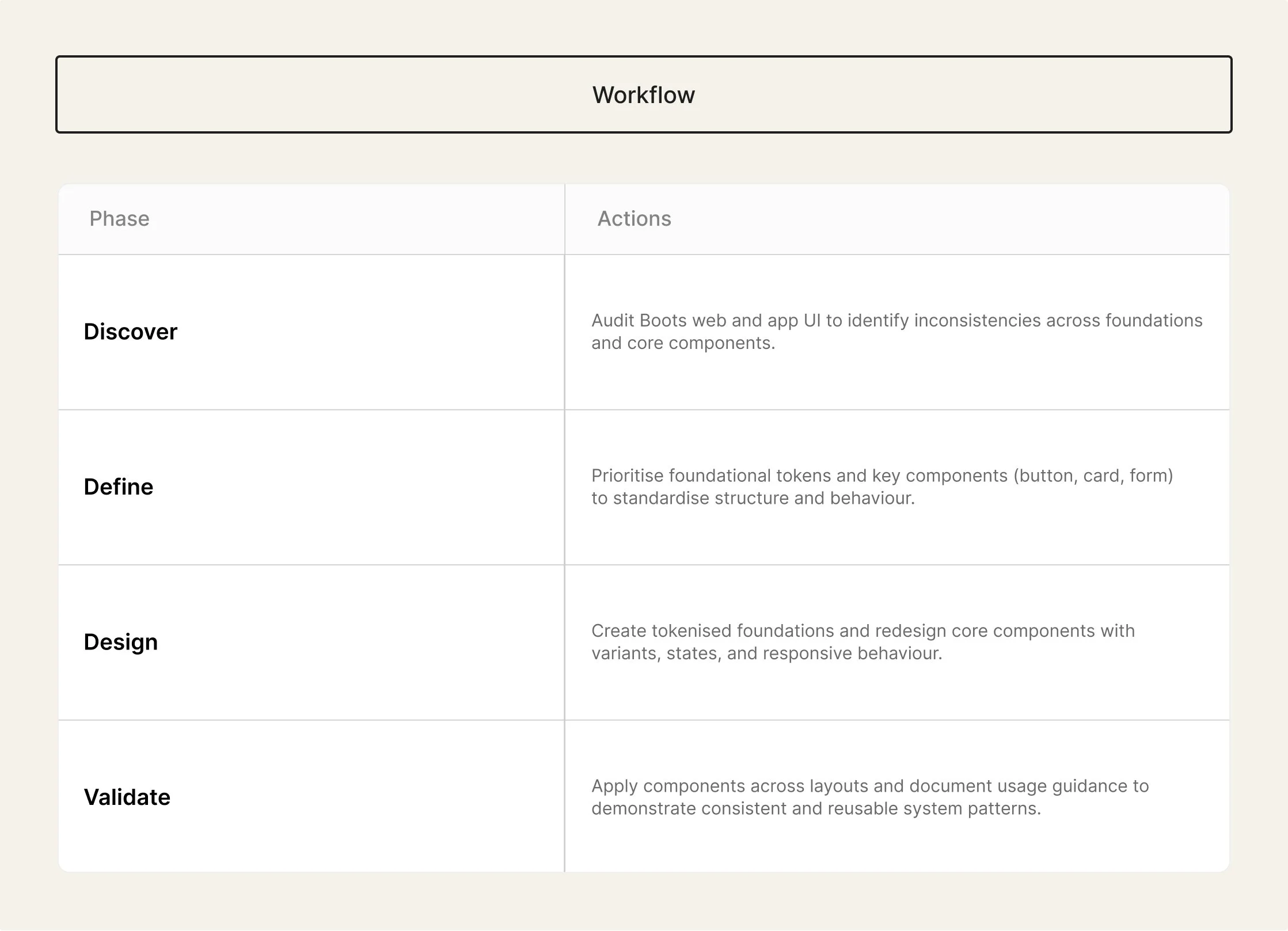
Workflow plan
Discover
Understanding the problem space
This section outlines how the problem space was understood through auditing Boots’ web and app interfaces, reviewing foundations, components, and accessibility considerations to identify inconsistencies and opportunities for standardisation.
Audit findings
Foundations (examples of colour, type, icons)
Platforms (web and app)
Inconsistencies
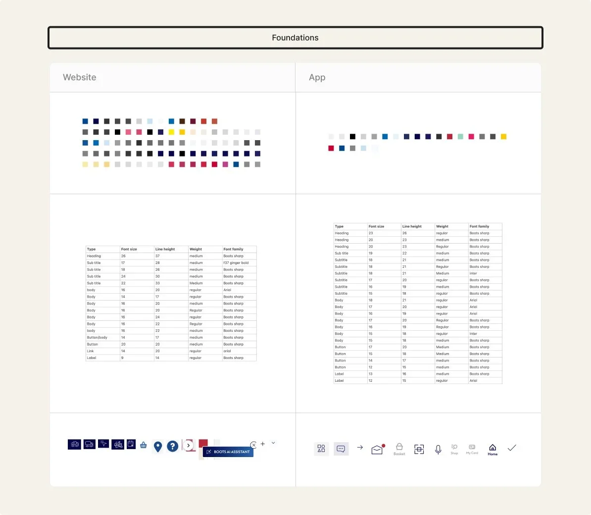
Foundations
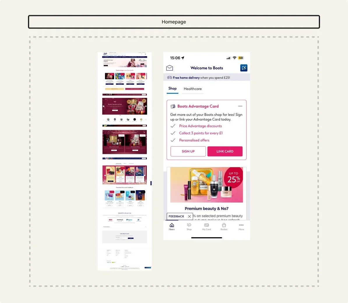
Reviewing key web and app screens showed alignment in core brand colours (dark blue, mid blue, black, white, greys, yellow), but supporting shades often differed slightly and some colours appeared on only one platform. Typography was also inconsistent, with more type styles and an additional font used in the app and only body text and some subtitles matching. Spacing values were not based on a shared scale, and iconography varied in colour and sizing between web and app.
Platforms
Following advice to review both web and app together, I compared how key journeys translated across platforms. While the overall visual direction was similar, layout structure, content sections, and component behaviour were not fully aligned. Some sections and patterns existed on one platform but not the other, and responsive behaviour was inconsistent between contexts.
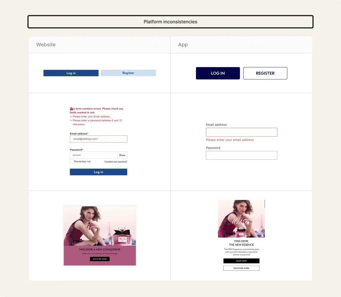
Incosistencies
Alongside foundational differences, core components also varied across platforms. Buttons used different colours, sizes, and states. Form inputs and error messaging were presented differently between web and app. Card components shared similar content but differed in layout, background treatment, and actions, with additional buttons or text variations depending on platform.
Summary
The audit showed that while Boots’ web and app shared a consistent visual direction, foundations and components were not structured as a unified system. Variations in colour values, typography, spacing, and component behaviour led to duplication and limited reuse. This highlighted an opportunity to redefine shared foundations and standardise key components to support consistency, accessibility, and scalability across platforms.
Define
Key decisions
This section outlines how the system priorities were defined, focusing on which foundations and components to standardise first to improve consistency across Boots web and app.
Consolidate high-impact components
Decision
Prioritised redesigning three high-impact components: button, card, and form.
Why
These components appeared across key journeys and surfaces, making them effective starting points to test consistency, accessibility, and reuse.
Outcome
Standardised component structures and behaviours, demonstrating how a small set of reusable components can support consistency across platforms.
Defining type scales for all interfaces
Establish shared foundations
Decision
Established shared colour, typography, spacing, and iconography foundations before redesigning components.
Why
Audit findings showed styles were visually similar but not structured as a system, making components difficult to standardise or reuse across platforms.
Outcome
Created a clearer foundation layer to support consistent component design and improve alignment across web and app.
Rough designs/ideas for each component
Support cross-platform scalability
Decision
Structured foundations and components to work across both web and app contexts.
Why
The audit showed web and app experiences followed a similar visual direction but lacked alignment in structure and behaviour.
Outcome
Created adaptable components and foundations that support a more unified, scalable system approach across platforms.
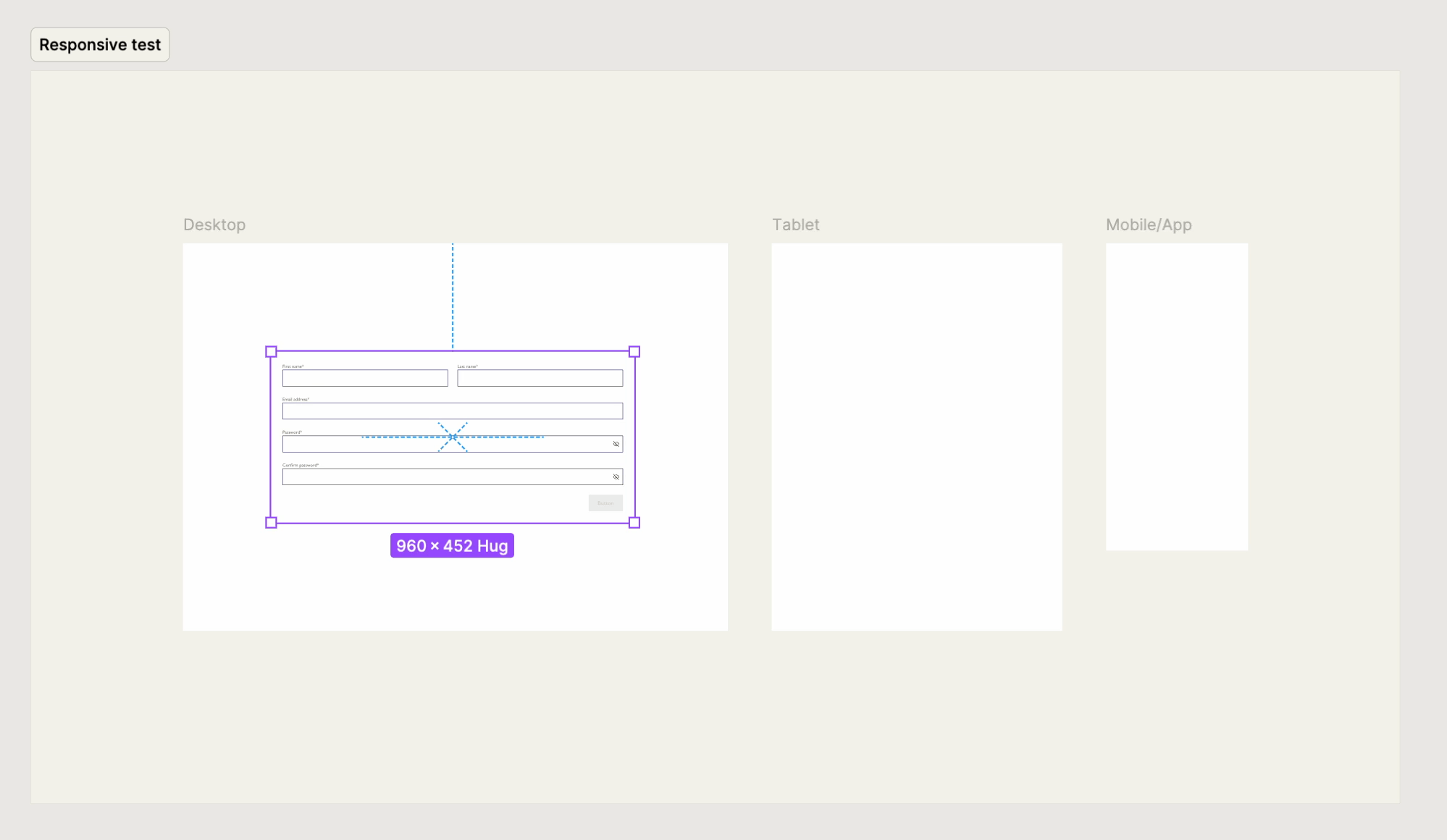
Testing the input form component on web and app
Design
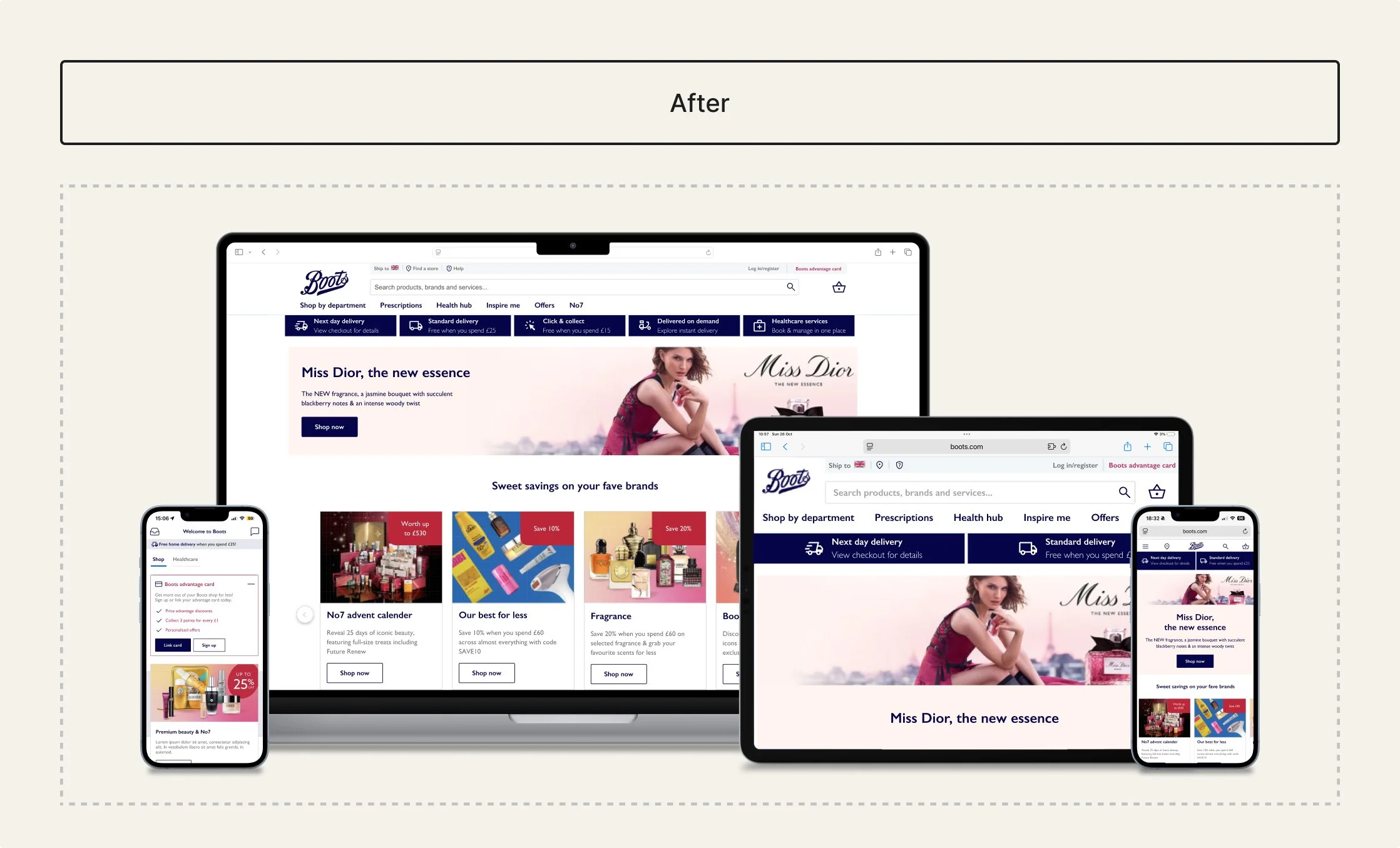
Building the system
To support scalable outputs, core components were standardised using shared foundations, with clear interaction states, accessibility considerations and consistent spacing across responsive layouts. This section focuses on the button component, highlighting decisions that improved consistency, usability and cross-platform reuse.
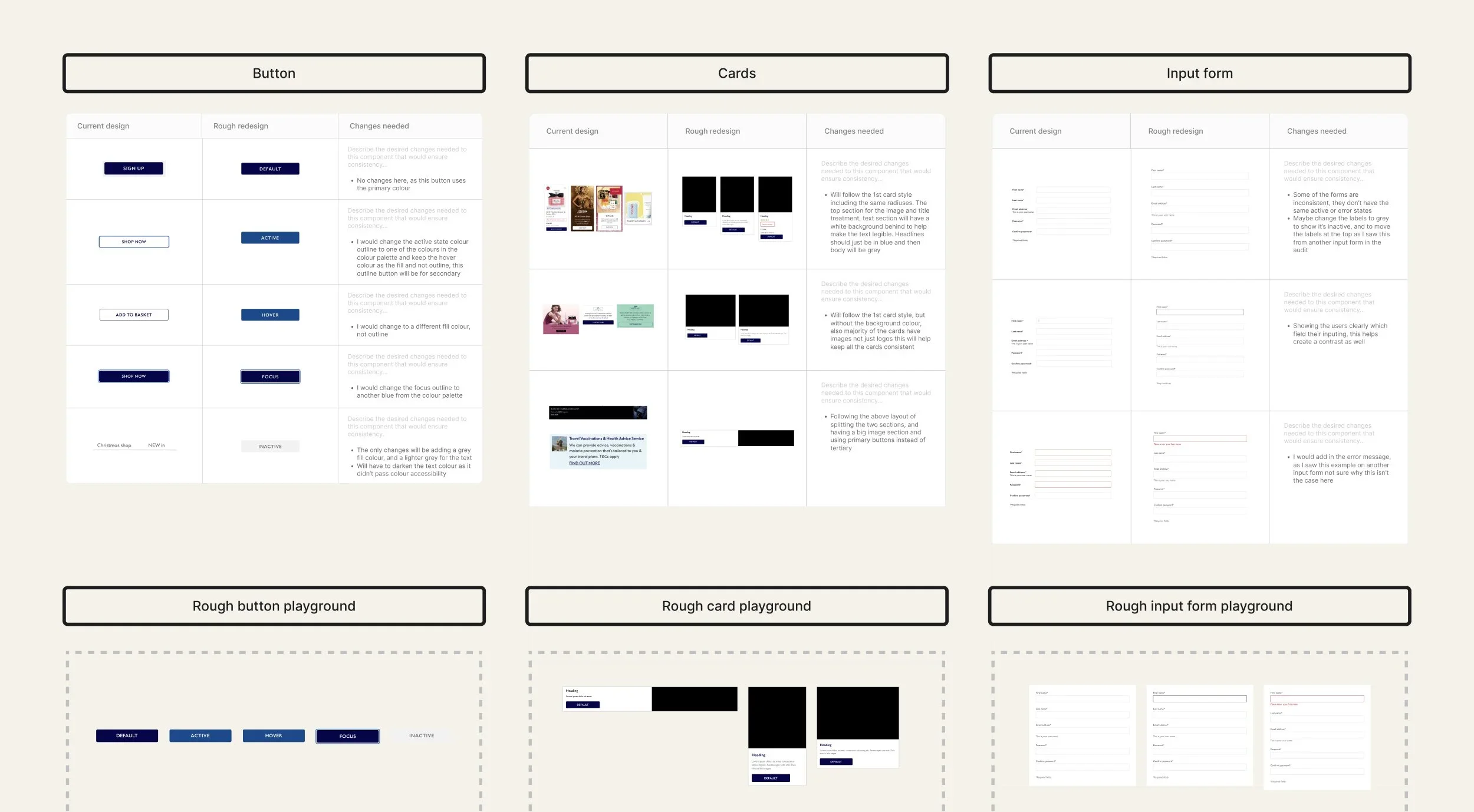
Button component deep dive
Before/problems
The audit revealed multiple button variations across web and app, with differences in size, colour, padding, and hierarchy. Some buttons used
uppercase labels, reducing readability, and there was no dark mode option.
These inconsistencies made reuse difficult and created unclear usage
across platforms.
Exploration
I defined button sizes, accessibility, and responsive behaviour to create a structure that could scale across layouts and platforms. This included reviewing text legibility, colour contrast, touch target sizes and more accessibility points, plus aligning the spacing and typography to shared foundations.
Variants
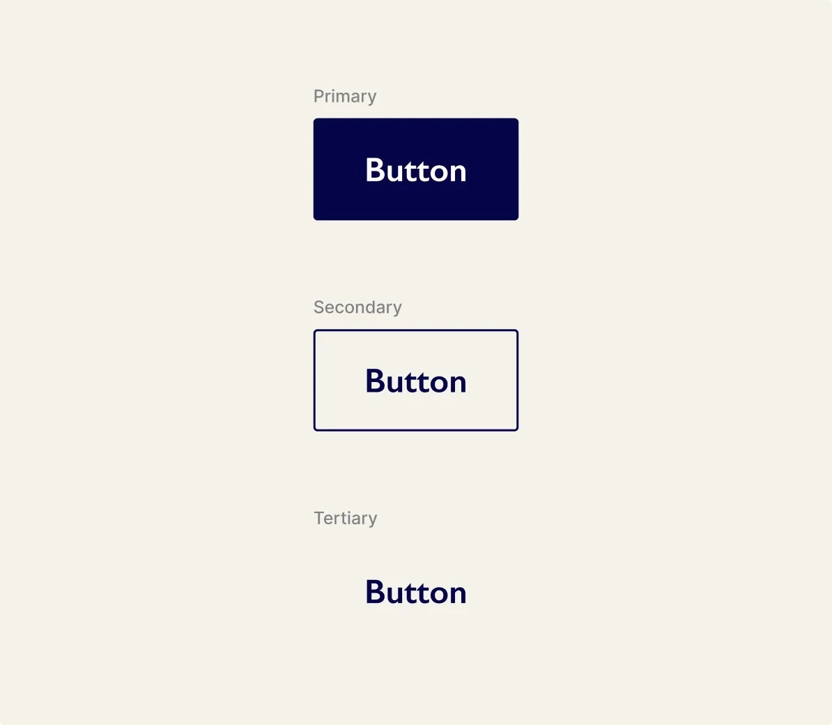
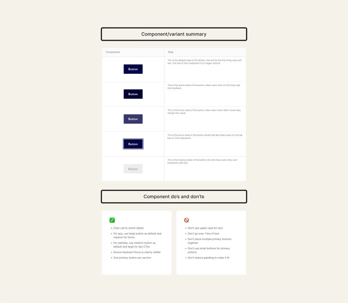
Standardised primary, secondary and tertiary variants to replace inconsistent styles across web and app.
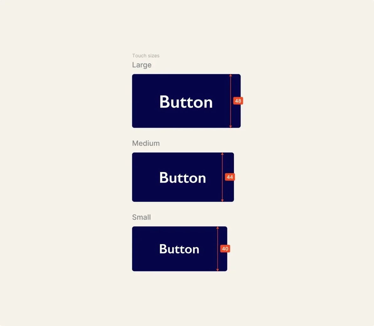
Sizes
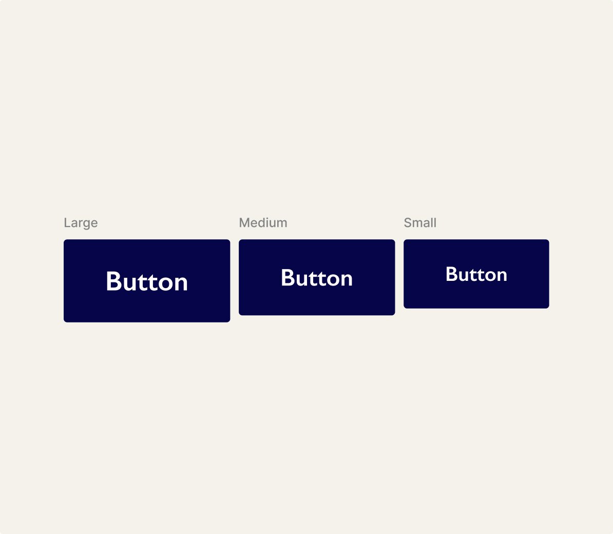
Defined large, medium, and small sizes to support different layouts and clearer decision-making.
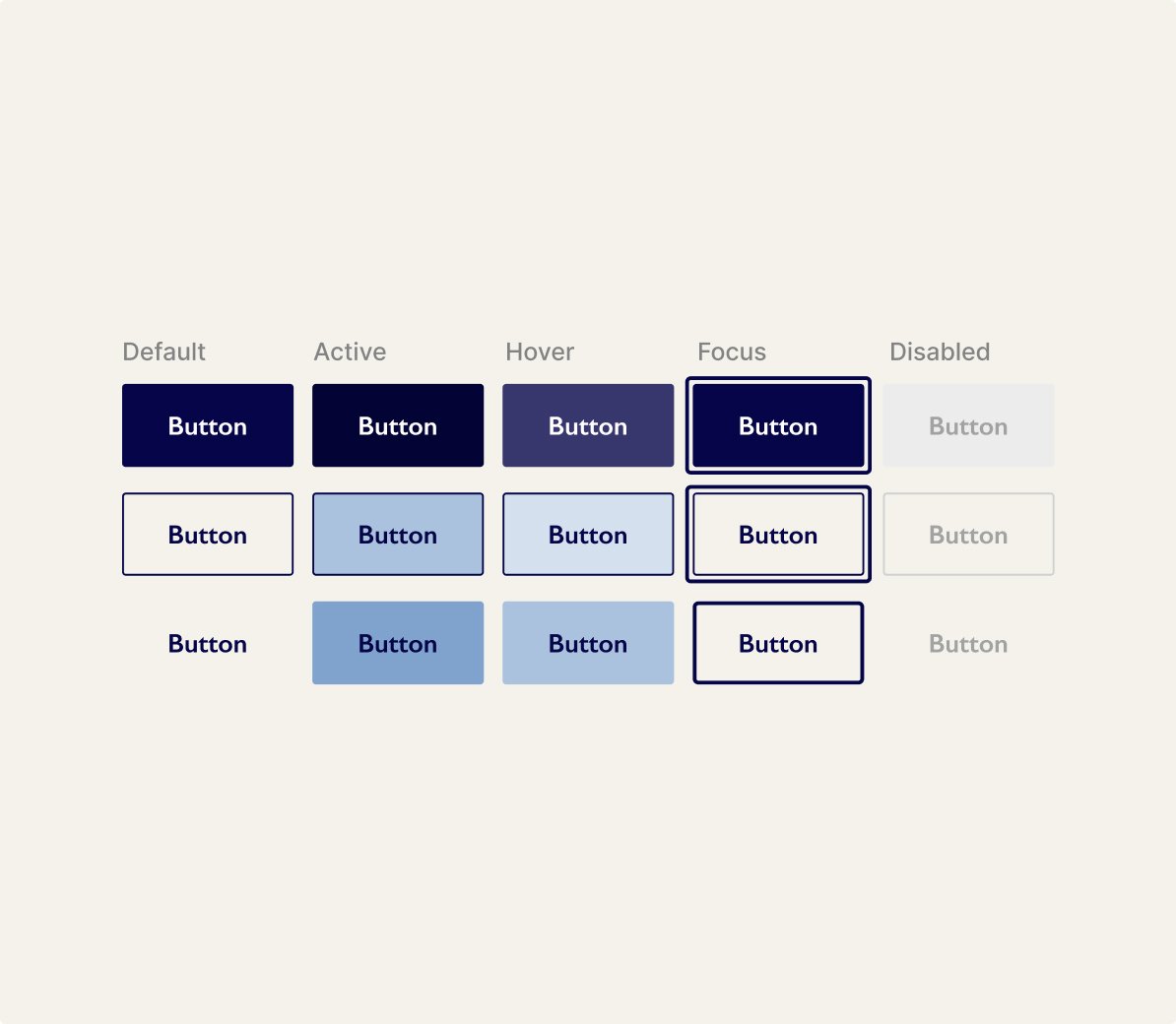
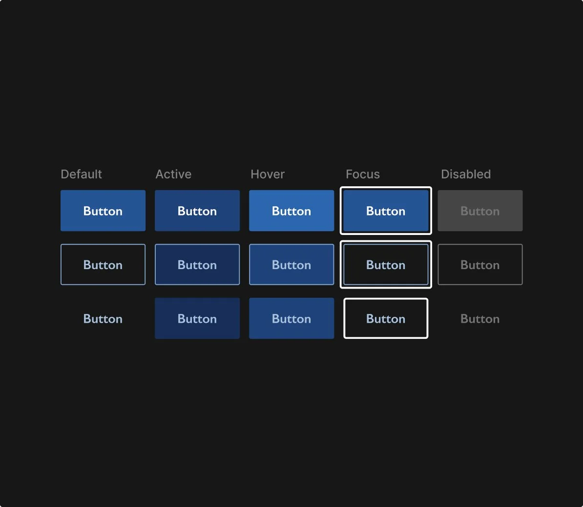
States
Refined hover, focus, active, and disabled states to improve feedback and align with shared foundations.
Accessibility
Checked contrast, legibility, and touch targets against WCAG to support inclusive use.
Dark mode
Introduced a dark mode variant to support accessibility and future theming needs.
Documentation
Created usage guidance and variant roles to support consistent adoption and decision-making.
Foundations and tokens
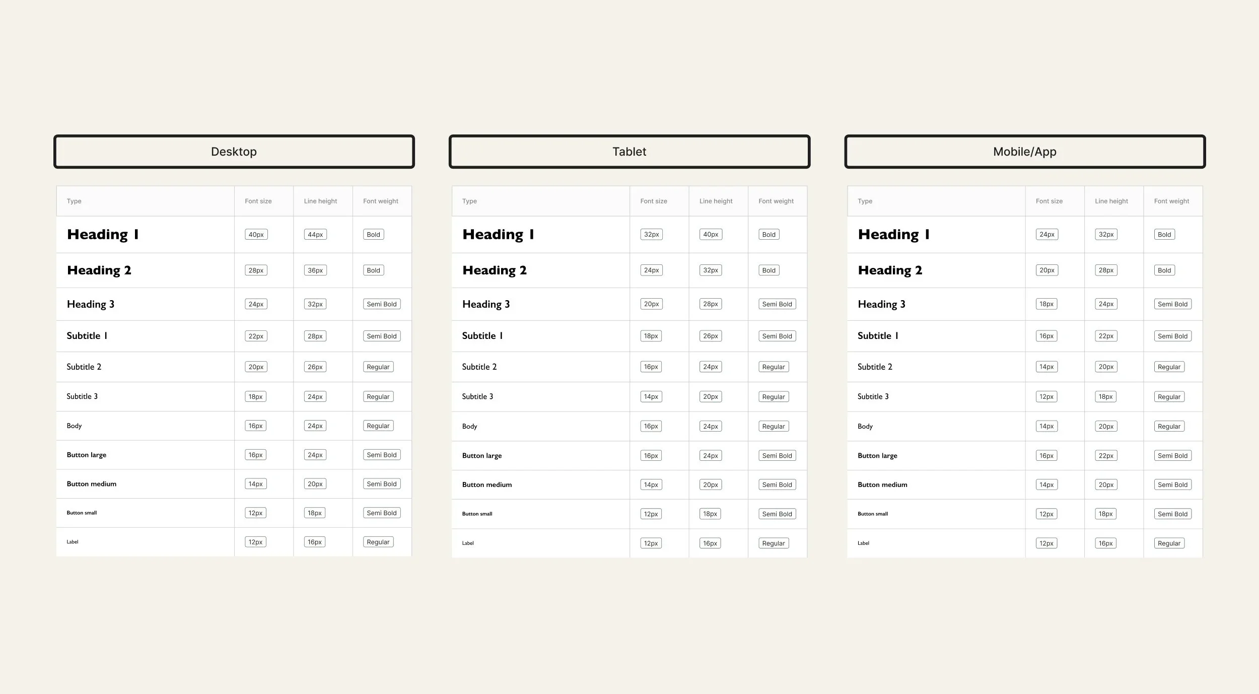
Typography
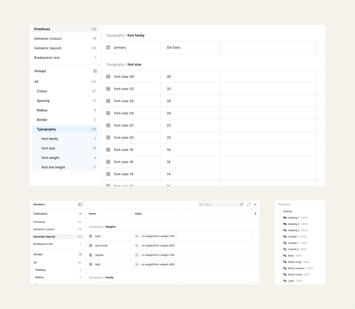
This was set up first in primitive tokens, including the font family, size, weights, line heights, then it was linked to semantic values linking to each type scale including heading, subtitles, body, button text and labels for all interfaces including desktop, tablet, mobile/app. This was then added into text styles,
so it’s easier to select and tokens so that it’s quicker to change.
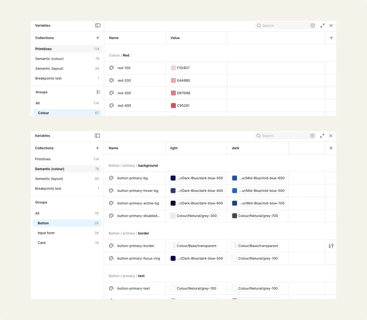
Colour
I set up all the brand and base colours for the primitive section, then in the semantics I assigned colours to each component’s background, border, text, label and icon. Colour and typography decisions were checked for contrast, readability and accessible interaction states to support inclusive use across themes.
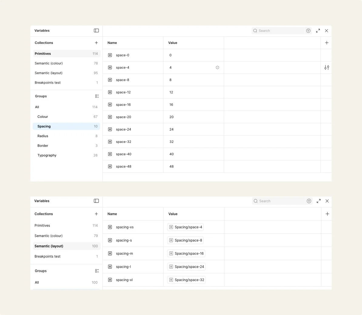
Spacing
I added all the spacing values I needed in the primitives, I also added in radius and border values too, then I assigned the spacing to semantic values for padding and then radius for border semantics and radius for the corner semantics.
Icongraphy
Following the audit, I replaced the icon set due to inconsistent styles and visual weights across the system. I standardised the library using Material Symbols as a base, mapping existing icons to the closest available matches and aligning them to a consistent grid, stroke weight, and sizing scale.
Validate
Making it usable, adoptable, and ready for scale
This section outlines how the system was tested and refined, and how it could be adopted and governed within a team environment.
Adoption
Who uses it
This was a self-initiated project developed independently. Components and foundations were designed for designers working across web and app surfaces, demonstrating how a shared system could support consistent use across platforms.
How it was tested and rolled out
Components were tested through accessibility checks, responsive testing across breakpoints, and iterative refinement. Feedback from experienced design system experts helped strengthen structure and usability. As an exploratory system, this was not formally released, but components were structured to be library-ready and scalable for future team adoption.
Where guidance lives
Usage guidance sits alongside each component within the Figma file, including variant roles, states, and do/don’t examples. In a production environment, this would be published within a shared design system library.
Engineering handoff
Structured components, states and tokens in Figma to support clear handoff and consistent implementation.
Governance
Intake & prioritisation
New component or pattern needs would be reviewed against existing foundations and components to determine whether reuse, extension or a new pattern is required. High impact patterns affecting multiple journeys (e.g. navigation, product cards, checkout actions) would be prioritised over one-off screens to support scalability and consistency across web and app.
Contribution & review
Components and tokens were structured in Figma using reusable foundations (colour, type, spacing and radius). Additions were reviewed against accessibility guidance and system principles to maintain consistency and flexibility across light and dark modes. Components were designed with states, responsiveness and token usage in mind so they could translate clearly into implementation.
Release & versioning
System updates would be released through versioned Figma library updates with accompanying documentation and usage guidance. Changes to foundations or components would be communicated through release notes to ensure designers understand what changed, why, and how to adopt updates consistently.
System evolution
Impact and growth
Impact
Defined shared foundations and reusable core components, improving consistency, accessibility, and scalability across web and app. Shows my ability to audit, tokenise, and structure components with adoption-ready documentation.
3 buttons
Instead of 29
1 icon set
Instead of 3
3 cards
Instead of 11
Learnings
Deepened my understanding of foundations-first systems, token structure, component variants, and accessible, reusable patterns. While this was a concept project, I built it with real world library management in mind, using proper component structure, variants, and organisation that would support team adoption and scalability.
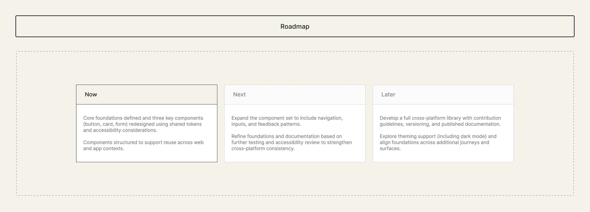
Next steps
Expand components, refine foundations through testing, and evolve into a documented, versioned cross-platform library with theming support.